


For nearly 60 years, Gérance Service has been part of the landscape of Villars-sur-Ollon. Founded in 1969, our family-run real estate agency has always been deeply connected to the region and to the people who make it what it is. When Fred Ernand succeeded his father Miguel at the helm of the company, he did not wish to break with that heritage, but to carry it into a new era. Deeply attached to what has been passed down to him, Fred keeps an eye on the future while always respecting tradition.
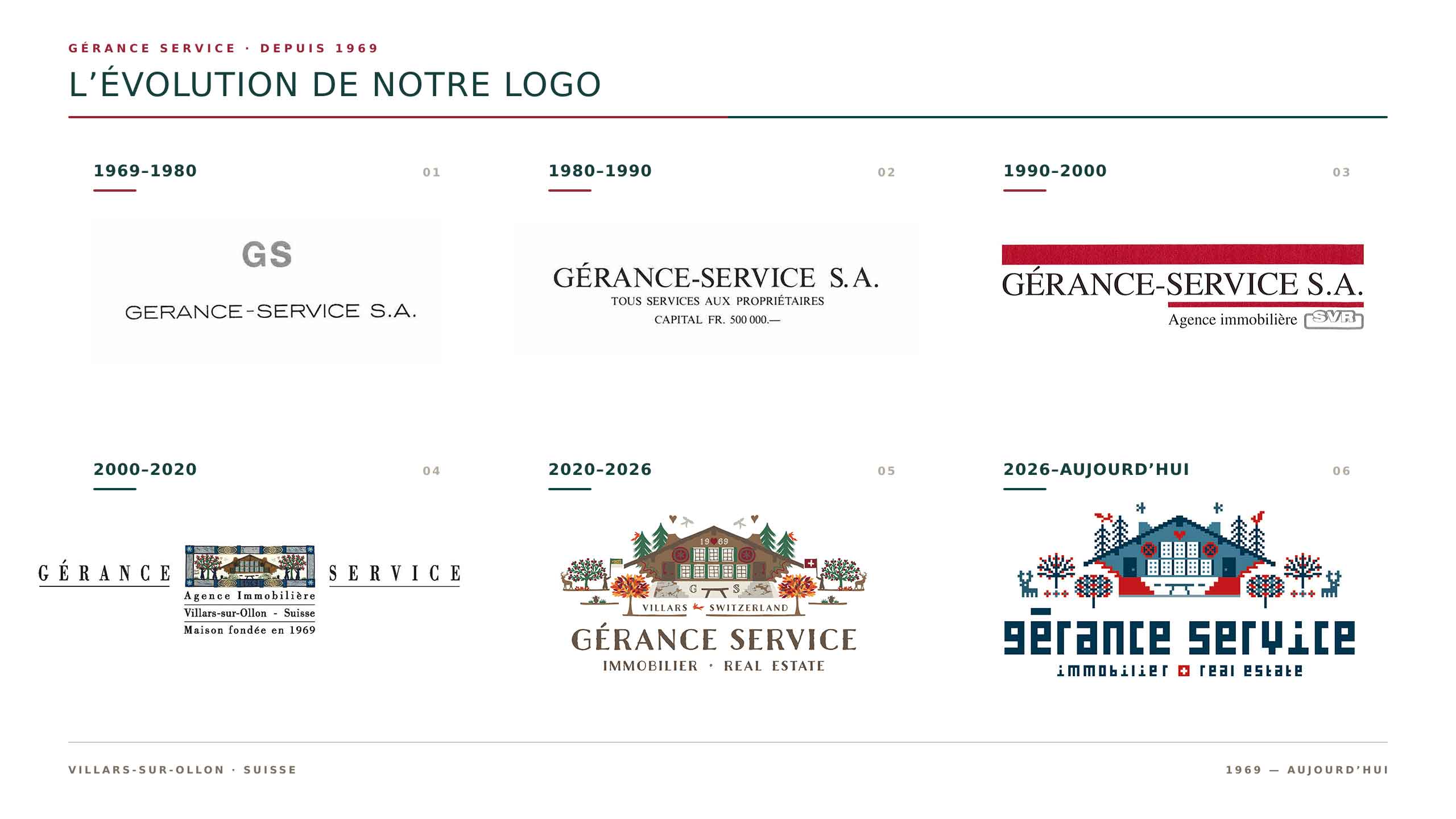
In 2000, Anne Rosat collaborated with Miguel Ernand to portray the world of Gérance Service in her very distinctive artistic language, deeply rooted in the tradition of Swiss papercutting and in the craftsmanship specific to the Pays-d’Enhaut region. That illustration then became a central element of the company’s identity.
In 2020, after seven years with Gérance Service, Fred took up this creation and, with Anne Rosat’s agreement, developed it further by drawing out several characteristic elements already hinted at in the original artwork: Villou, the resort’s emblematic fox; the fir trees — an inexhaustible topic at condominium owners’ meetings — as well as the seasonality of Villars and its colours that shift over the course of the months. The aim was not to replace Anne Rosat’s work, but to extend her world.
Today, Miguel’s retirement coincides with a new transformation of our profession. Digitalisation, computerisation and now artificial intelligence are everywhere. We therefore wanted to give Gérance Service a visual identity faithful to this new reality, while remaining deeply anchored in its history.
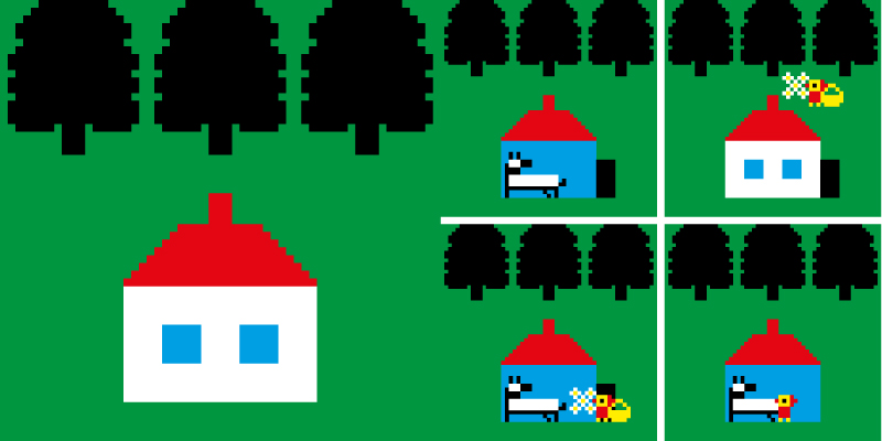
The choice of the pixel is not a way of chasing a trend. It is the natural continuation of Swiss papercutting in a digital language. For a clientele whose average age is close to 70, it also evokes the early days of computing: a time when technology seemed simpler, more legible, and when the human being remained present and indispensable.
The success of the mHouse management software developed for the agency is a concrete illustration of this. By reducing administrative tasks wherever possible, technology allows the Gérance Service teams to be more present than ever in the field and more available to talk directly with clients. Digital tools should free up time for people, not erase them.
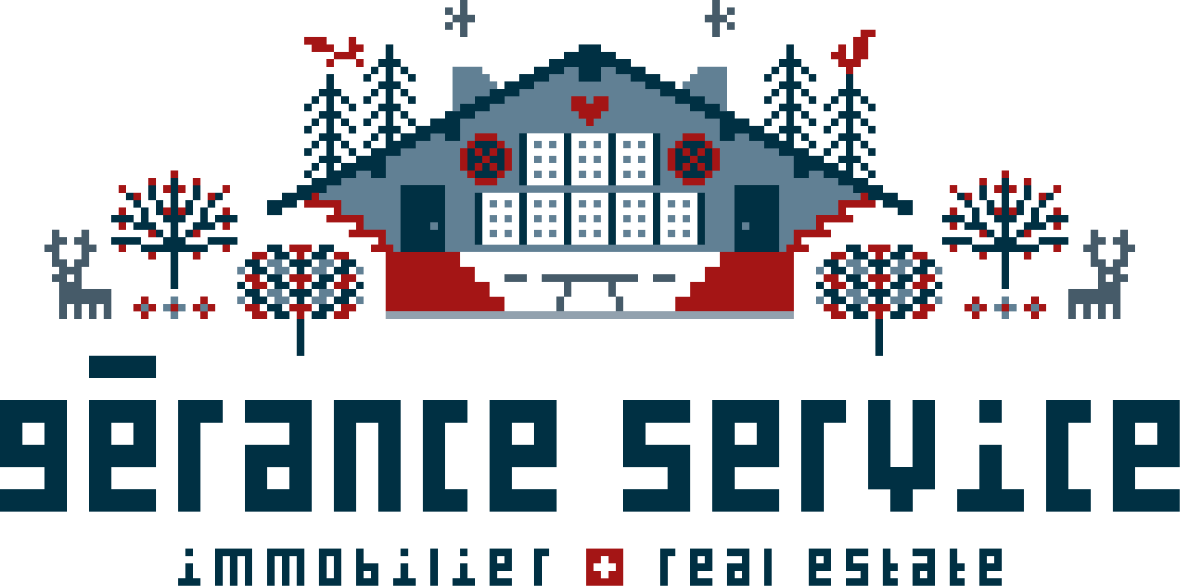
Working with Budapest-based illustrator Tibor Kárpáti and graphic designer Zsolt Zimmermann, we therefore did not set out simply to modernise a logo. Together, they transposed the spirit of Swiss papercutting into the world of the pixel and built an entire visual language around the brand, inspired by Villars, the nature of the Pre-Alps, and the legacy left by Anne Rosat.
This approach responds neither to passing trends, nor to an ultra-contemporary style that goes out of fashion as quickly as it appears, nor to a minimalism so stripped-down that it ends up feeling impersonal. Nor is it built on the idea of replacing people with machines. The identity of Gérance Service must remain alive, generous, local and profoundly human.
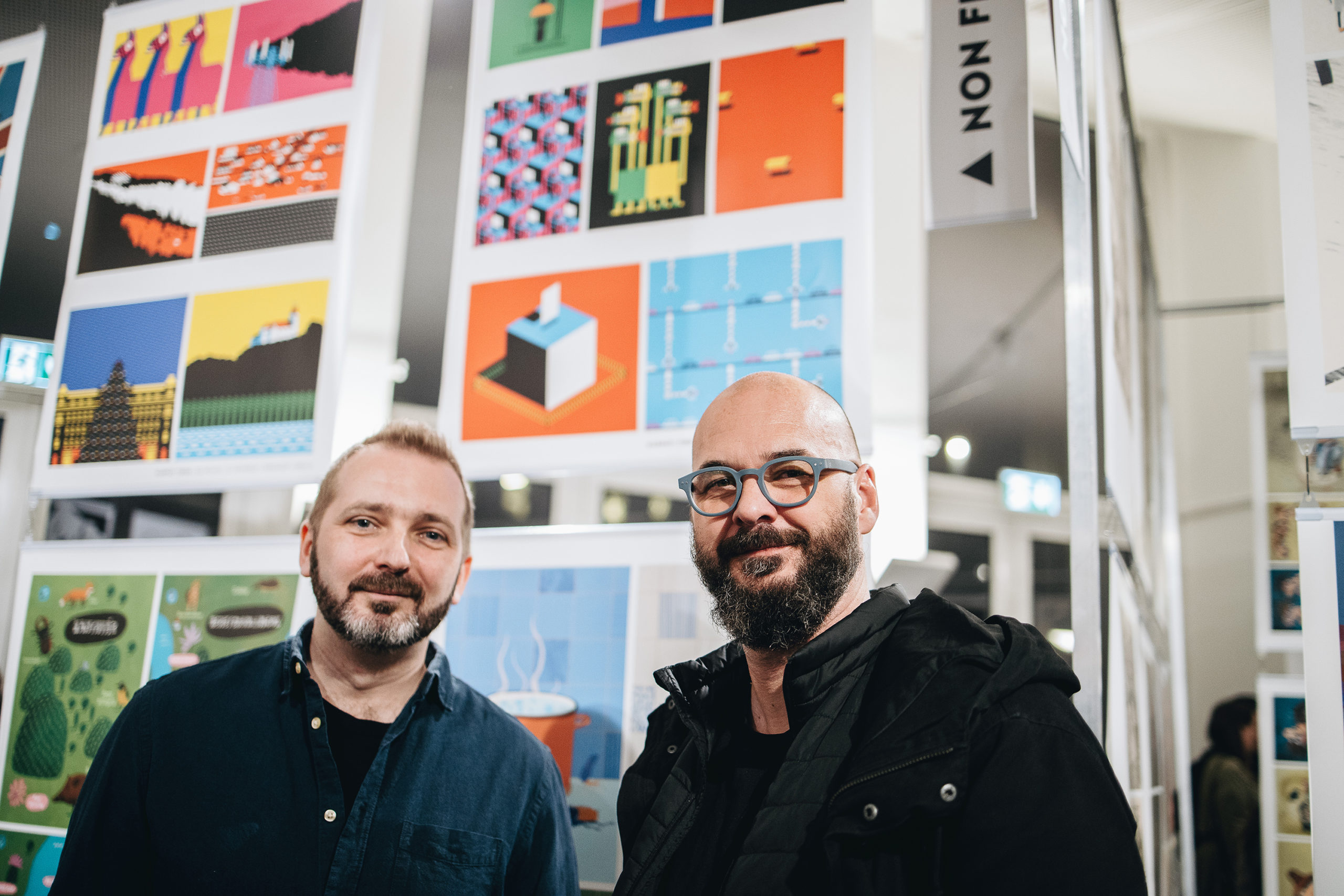
In the interview that follows, Tibor and Zsolt look back on their collaboration, their creative process, the influence of Swiss landscapes and of Anne Rosat’s work, and the story of the pixel squirrels that have become the new companions of Gérance Service.
Can you please introduce yourself: where do you come from, what’s your story, what’s your activity, your main projects, your techniques?
Tibor: I work as an illustrator in Budapest. Exactly 20 years ago, my first storybook was published, featuring my pixel characters. Since then, they have come a long way and have appeared in magazines such as The New Yorker, The New York Times, GQ, MIT Technology Review, Golf Digest, Barron’s, Wired, and Bon Appétit. They have also been commissioned by clients such as Hermès, Apple, and Disney.
A few years ago, Zsolt, as the art director of a publishing company, approached me about illustrating a public affairs magazine. We developed a very good working relationship and have since worked on several projects together.
When Fred Ernand approached me, it was clear to me that Zsolt and I had to work together on the visual identity. He has a wealth of experience in visual identity design and brand building, including the visual identity of Hungary’s largest construction company, which bears his mark.
Zsolt: I also live in Budapest and work as a graphic designer. During my 30-year experience, I have created advertisements, served as art director for several publishing companies, and designed the visual identity for numerous companies.
One of my most exciting projects was the one I worked on with Tibor. I redesigned a national weekly magazine, which featured a unique illustration on its cover every week. I asked Tibor, one of the best illustrators, to contribute several times, and he created fantastic covers for us.
After that, we also worked on The Budapester project, which Tibor already mentioned. I have participated in many branding projects in various areas of the corporate sector. I created a visual identity for a small art gallery and a major branding project for one of Hungary’s leading construction companies. In addition, I have my own art and design projects, which have resulted in exhibitions and collaborations.
Can you describe the result of the brand identity rework, and explain what messages you are trying to convey through this new identity?
Zsolt: Our basic approach to the task was that we definitely did not want to give the brand a strict image, but rather a unique creative world that offers enormous freedom of use.
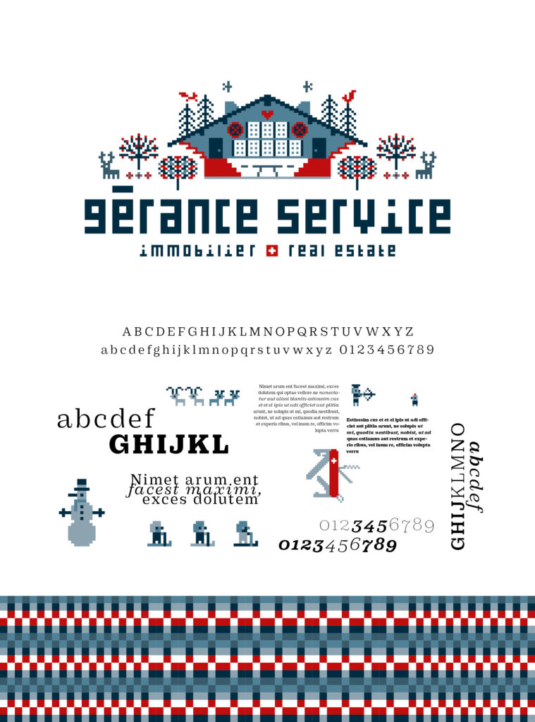
When Fred took over the management of the company, he wanted to give it a younger, more modern image. In addition to giving the old logo a more contemporary look, we created a narrative world that enriches the brand’s appearance with numerous additional elements. We divided this world into three groups:
- The world of people
- The natural environment, with its animals, plants, and mountains
- Swiss attributes
Using these elements together allows us to tell a wide variety of stories.
On top of this, a finely tuned colour harmony and the world of pixels inspired us to create a playful, captivating pattern system. This design language can become a spectacular element in decorative applications.
The rather complex world outlined above lends the brand a very diverse and playful appearance. Its well-thought-out, coherent system of forms and colours meets a richly varied narrative world. Their combined use gives rise to the modern, playful appearance of the Gérance Service brand today.
What inspiration and guidelines did you have in mind while creating the new identity? What was important to preserve and to change for a brand that’s over 50 years old?
Tibor: There was a very clear inspiration when creating the illustrations. My task was to transform into pixels the visual world of Anne Rosat, a designer who played a key role in the company’s previous image. What connects us is that we both designed scarves for Hermès. I feel truly honoured to have been able to work with illustrations of such high quality, and I hope I didn’t disappoint Anne Rosat.
It wasn’t difficult; I really enjoyed the process, and perhaps this is reflected in the end result.
Zsolt: In addition to modernising the old logo, we wanted to design a system that could be used in a very creative and diverse way. What always excites me in my work is how I can create a distinctive visual system for the client that allows for a variety of uses. It clearly sets them apart from their competitors and provides a truly singular, memorable visual experience.
What element was the most challenging for you and what are you most proud of?
Tibor: The pixel-by-pixel transcription of the panoramic images of the Swiss mountains took time, but I love the end result. I am definitely most proud of the fact that I was entrusted with reinterpreting the now classic illustrations of a Hermès designer. And, of course, the pixel squirrels 🙂
Zsolt: The biggest and most exciting challenge was figuring out how this visual world would work together as a whole. How could we make them work together? It was a great joy when it all came together.
When we first broke up the typography, paradoxically, we felt that something had come together, that something very exciting was developing. By the way, I’m quite a pattern maniac, I’ve designed a lot of them, so I was very happy to create the brand’s patterns.
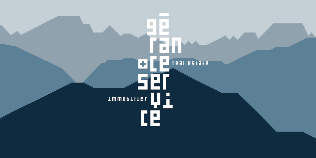
Pixel-by-pixel transcription of the panoramic images of the Swiss mountains
What is next for you in terms of projects?
Tibor: Zsolt and I are planning a large-scale illustration project for a telecommunications company. I am also working on something for Hermès… That’s all I can say at the moment 🙂
Zsolt: In addition to the joint project with Tibor, I’m currently designing a book for a photographer and working with a winery. Several other projects are in the works, but unfortunately I can’t talk about them yet. 🙂
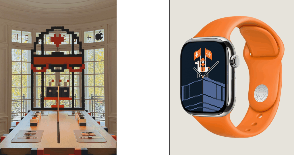
Tibor for Hermès and Apple